After the amazing
Paul Richards posted an analysis on gold (based on the tutelage of
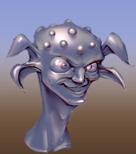
Mathias Verhasselt) I was compelled by the lure of beautiful renderings to follow along. Here's mine, plus a breakdown of layers and stuff after some experiments with color eye-dropping and layer mode transfers.
All of these were solid color layers, painted in with layer masks plus a clipping mask to the original silhouette layer. I've been off this system for a while, due to early days as a photoshop n00b being frustrated with jumbles of unnavigable layers and layer groups. But coming back to the philosophy of one layer per art pass was nice, in that it really fixes the eye-dropper problem of mud color.
Also, check out the photoshop filter
Pixel Bender, specifically the Oil Painting mode. When used on a sketch, it generates really nice ink-like results, that follow contours rather than just blotching in pixels. You still will need to hand-edit stuff, but it cuts out a rather big step!
I'm also using a two-tool setup for most of my brush work (all of which is being done via masks). First, a round brush set to full hardness with pen pressure affecting size. However, it's not set to full pressure, as that gives you the ugly Photoshop rat-tails. I used this to lay in block passes, switching between black and white with X. Second, I use the new Mixer Brush tool, which functions like a more advanced smudge tool. (In fact, I reset my R hotkey to it.) After the block pass, I blur some edges with this. I've found that it's way easier to start with hard edges and make them soft, rather than to start by fuzzing in soft edges and hoping for hard edges later.
The layer setup also lets you simply change the base layer with pretty convincing results right away. Case in point, assuming the base metal would absorb less base color, here's a darker metal that still reads pretty realistically.

oscarbaechler@gmail.com
 View Oscar Baechler's profile
