7/27/10

Textiles

For the past year or so, I've been ashamed to admit a growing nerdiness about textiles. For Seattleites, the Seattle Asian Art Museum and the SAM both have a number of kimonos and primary source outfits with fantastic textiles, so if you're in the area I recommend taking another look at these.

Why are textiles something to think about?
1. You can't sculpt them in a 3D program
2. Outfits can say a lot more about a culture than the creature anatomy wearing them.
3. 3D and 2D art both tend to focus on contrast and silhouette first, material texture second, and fabric pattern...last? There's a ton of resources about fabric drapery for 2D drawings, 3D sculpting and cloth simulation, but very little discussion about what's on that fabric.

It was really bugging me that with most detailed fabrics, the 3D inclination is to #1. find a photograph of a fabric and #2. call it a day. But the more you look at fabrics, the more something even this complicated actually seems to be laid out in an approachable style. This is my first attempt at making up a process to address the problem, and it turned out passably IMHO.


The process is really quite simple; essentially you're making a big detailed square, then putting another big detailed square on top of it. It was so easy, I spent 15 minutes to make a tutorial!


So what does it look like in 3D? Here's a quick attempt to throw it on the Turtle That Won't Die. Not much going on yet other than procedurally unwrapping to the rug texture, plus a node setup to generate a normal map off the texture.


www.oscarts.org oscarbaechler@gmail.com

7/15/10

Blogging your art vs. polishing a portfolio

To start with, the obvious conclusion: Yes, hybrid is the answer, using a blog that surrounds its outer border with your best art, right up front for early viewing pleasure, followed by an up-to-date assessment of what you did last week in the form of a blog post.

But I wanted to sing the praises of blogging regularly. Updating a blog regularly presents oneself in a way portfolios can't: a lifestyle artist. When you are viewing a person's portfolio, it can feel like the job interview, with them casting themselves in their best light. But when you're reading their blog, it's the day-in and day-out of their artistic life. It's habits versus single spit-shined presentation, and habits count for a lot. Nearly everyone can relate to a great first impression with someone, only to learn that their daily habits include no reading, too much television, drinking too much, avoiding spicy food, or chronic lateness.

Many good artists have said drawing is just like physical exercise: talent counts for very little if you don't work out regularly. Similarly, a lack of daily practice in art shows. It doesn't matter if you've won a gold medal, a pot belly speaks about your daily habits in the here and now. If you haven't drawn anything in a week, it's probably noticable.

Anyway, I drew some stuff. Oh snap, 8.5 x 11 is so much more easy to scan! Although this first one's actually a straggler from my other sketchbook, which I somehow forgot.


Ahem, put at small size. On account of da nakedness. Also, I want to give a shout out to Paul Richards, whose blog at http://autodestructdigital.blogspot.com/ has been fantastic to read. I found it completely by accident while doing a GIS for Paul Richards. He's awesome, and everyone could stand to learn some amazing things from his insight. I think he's been behind a lot of my naked lady drawings lately, which he elevates to a masterful art.


Sketchbook theme: BLOW MINDZ. Although I think I also want to bring back extra rendering in this one, since my last book was a bit too gestural for me.


These last ones were drawn off a google search for "Women's hairstyles." Easy spot to get pleasing, unique mugshots!

Thus far, I believe I am failing at blowing mindz this sketchbook. Again with the head drawings! Hopefully I'll pick up the pace in the coming week.

www.oscarts.org oscarbaechler@gmail.com

7/11/10

Anuzzer sketchbook, mon frére

Once again, uploaded in reverse chronology. Which makes the final image a humorous summary of the whole sketchbook: nekkid ladies, dinosaurs, fat dog, and animals. Speaking of which, warning: nekkid ladies. I don't care about gestures, but the ones with more graphic, ahem, renderings are all resized tiny to protect your innocence. Click the thumbnails to enlarge at your own risk!!!


Teehee, at this point I'm ashamed at how many of these I've had to make thumbnail sized.


www.oscarts.org oscarbaechler@gmail.com

Zoinks!

Here's my breakdown of a sketchbook's workload:
1.5 hours of boring scanning
1.5 hours of boring editing
.5 hours of boring posting

Anyway, my other finished sketchbook ought to be posted soon. Why can't the scanning/editing/posting be as fun as the drawing?

www.oscarts.orgoscarbaechler@gmail.com

7/8/10

Good bye, 11x14. We'll always have Amsterdam.

First up, some highly belated sketches from Christmas through March. I've got a whole secondary book I've finished since then, more on that later.

Due to how these get added to blog posts, they're actually in reverse chronology. Always interesting to see, IMHO; near the end of a sketchbook drawings get way better, because I get nervous about having nothing good to scan. Anyway, enjoy!


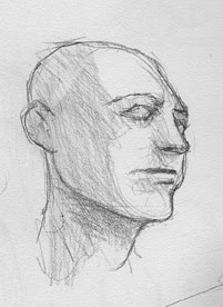
I like doing "head storms," a common subject for daily sketchers who just need an easy boring theme to fill a page. Additionally worth noting, I draw further and further away from shading in this cycle, because I've felt more and more like drawings should be clean for taking into photoshop.


Sucks from the neck down.


I've recently fallen into the habit of drawing nekkid people a lot more. Additionally, I've become much more comfortable with the obvious goal of nekkidness (sexy posing) in lieu of the standard "classy life-drawing" poses. A pity teachers can never actively tell you (or a model) to just make it sexier, for fear of lawsuits or unteacherly conduct.


Drawn from some painting on display at The Frye in Seattle, my absolute favorite museum.


The first part of this was fun, and from an old drawing exercise of mine. You imagine some phony sparring game plot line, like "Blah blah blah magic crystal, and all the celestial beings agree that their champions will fight on their behalf across the earth!" Then design a bunch of quick characters for said setting.


Anyway, hope you like! The next sketchbook will be up by Sunday probably.

Speaking of which...As my 25th birthday approaches (tomorrow), it's time for me to say goodbye to an old friend: the 11x14 bound sketchbook. Over the last 2.5 years, it's been my drawing medium of choice with good reason. I originally switched to this huge format to combat two things: cramped drawings, and long-term durability. Before I began using them, I dilligently filled up a bunch of half-full sketchbooks from school, as teachers would want you to have a class-specific sketchbook that usually couldn't be filled in a quarter alone. As a result, I mysteriously get way better at drawing halfway through them. Additionally, most of my pre-11x14 sketchbooks are a bizarre mix of formats, paper quality and binding.
But rest assured, I'm retiring the 11x14 for good reasons. First, it's sucks to scan something larger than your scanner. I have to scan each page chunk twice, then put 'em together in Photoshop. Double the scanning, double the editing. The reason I scan huge loads of pictures all at once is because scanning a large sketchbook means moving my scanner/printer into a cumbersome spot on the middle of my desk.
So yes, I am sacrificing artistic integrity and large formatting, in exchange for ease of use and avoidance of tedium. I'll miss the extra space, but I won't miss devoting a whole weekend to standing over my printer.

Ogbog out!

www.oscarts.org
oscarbaechler@gmail.com