12/29/08

Thanks, white Christmas!

Seattle was covered in snow for a week and change until Saturday. Which was cool for me, because I got a week of working from home! Once again, props to Blender for being the open source wonder that it is; Had I been on Maya or Max, I'd need an at-home commercial license, and would have been out of luck like so many commuters in Seattle.

My other Christmas present is a new apartment in upper Fremont, which I'll be moving into in about three days. One of the best parts about this new location is that it's walking distance from the Woodland Park Zoo. As a card-carrying member of the zoo ($45 for unlimited visits, Definitely worth it!) I'm looking forward to regular visits with my sketchbook. 

As an additional item of business, the primary outline for what I hope is my first book has been completed. My New Years resolution is to have it completed this time next year. I am reminded of something Hubert Selby Jr., author of "Requiem for a Dream," said in his biographical documentary. If someone says they don't like it, or it can't get published, who cares? Send it to a hundred people, or a thousand. Something like that. Point being, it's better to write a crappy book and say you did it, and your next one might be better, than to be defeated by your own self esteem on day one. 

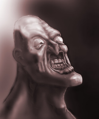
And, lastly, I returned to an old project, this time via the wonderful world of Blender! I originally made this project in Maya and Mudbox, but never really completed it. I've got a much better grasp of my modeling, unwrapping and texturing process now, and thus have finally started moving forward with some sort of color completion on this. 

There's many things I'd do differently on a second go-round for this. But since I think it silhouettes awesomely and was 75% completed already, no use in startng over. If you compare it with the original, you'll notice I made the upper body into a muscular, angry character this time around. Props to Blender's proportional editing falloff and sculpting tools! 


www.oscarts.org
oscarbaechler@gmail.com

12/21/08

The next generation of the gaming market.

I just typed this up for another quadrant of the internet, but it's something I've repeated so often that I thought I'd put it down somewhere official. Then in a few years I can look back and talk of how sagely or ignorant I was.

PCs are a difficult market because you can steal games. Consoles are a difficult market because you can resell games, thus limiting creators to one profit per hard copy when said hard copy changes hands five times. This often equates to a $50 sale and several $45 sales by GameStop, with creators only touching that initial $50. I think the future of gaming will be an evolution of the "Online Console Marketplace," where games are downloaded over proprietary hardware (consoles instead of PCs.) This gives extensive security against game stealing, and also eliminates the reselling dilemma. Furthermore, with proliferation of broadband (and if Obama does his rural broadband infrastructure thing, even more so) and hard drive space being a joke these days, the tech limitations that neutered this business model in the past are no longer concerns.
The only other part of this to address is the transference of interface. Many people (myself included) find a keyboard and mouse the ideal interface; a keyboard provides a multitude of keys and a typing interface to aid communication, while a mouse alone can provide as many buttons as an entire console controller. Furthermore, console joysticks can't provide the precision movements of a mouse. However, I think it's easy to get over this simply by providing more support for keyboards and mouses for console gaming, even packaging consoles with this option. One thing that Guitar Hero has shown us is that people don't mind maneuvering large piles of hardware to get a good gaming experience.

Anyway, that's my oft-repeated position on the future of gaming.

www.oscarts.org
oscarbaechler@gmail.com

12/13/08

Alien update
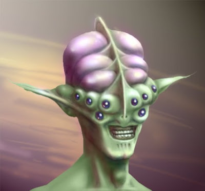

Here's an update on my alien I've been toying around with in photoshop. Since this was just for fun, I doubt I'll mess around with it any more. However, I'm glad I at least took the leap into color, which normally is where I get fatigued with my personal projects.


www.oscarts.org
oscarbaechler@gmail.com

12/10/08

The 100-pronged structure attack

Like every sniveling arts & culture nerd, I've been "working on my novel," which is so frequently ridiculed that it's hard to understand anyone posting about it, unless they already sold it to a publisher. But really quick, here's a few thoughts in my defense, many of which are just about my artistic philosophy in general.

1. I'm young! Better to start now at 23, rather than waiting until I retire or my kids go to college.
2. In my artistic experience (mostly with different forms of visual art, but also with cooking and writing) everyone starts off bad. You have X number of failed attempts and disasters in you before you'll produce anything remotely worthwhile. Hence, the best thing to do is just get these disasters out of the way as quickly as possible through regularly working on them. In a forgotten age, this was known as "Practice." In other words, the best way to look at your first novel is this: practice for your second novel. Thus, once I get this one out of the way, the second one will come faster and sharper.
3. I occasionally scribble this down as something I want on my tombstone: "The world's worst drawing is a lack thereof."  In other words, I'll take the guy doing the crappy, biginner's-step awful art over the guy who's too lazy to do anything but heckle any day. 
4. It's good for you, internally! I dislike it when people stretch creative muscles for the wrong reasons. Too many people figure their book would suck, and therefore not sell, and therefore serve no purpose. What ever happened to writing for fun?  In terms of what should motivate you for creativity, here's how I prioritize things: #1. Do it for yourself, #2. Do it for viewers/readers and their praise, and #3. Do it for material success. If I enjoy writing, who cares if it doesn't sell, or even if nobody likes it?
5. I feel like I've had enough of a win ratio with smaller writing projects that I can be motivated about this.


Now that I've written another overly long contextual introduction, here's what I wanted to bring up. I'm a big fan of structure. In fact, I think it's the most important part of writing. If it sucks and rambles in its outline, paragraph or logline format, it'll  suck in its larger format. Although my methods have changed, I haven't written a story without outlining in some form or another since sophomore year of high school. 

But what to outline with? There's any number of recorded outlining formats, and zealous cults form around all of them. Here's some of the ones I'm familiar with:

1. Syd Field's 3-act screenwriting formula
2. Any number of structural recommendations from Blake Snyder's "Save the Cat!" including his personal logline format and his 15 beat story outline.
3. The Hero's Journey, made superfamous from Star Wars
4. One my teacher Stephen Glover was a fan of was a 9-beat arc, labeled "You, Go, Seek, Find, Take, Return, Change." In other words, a protagonist plus six verbs.
5. Any number of "Adventure Planning Guides" recommended for roleplaying games.
6. An arbitrary order of events, which was the first way I outlined (before I knew outlining and structure were so beneficial.)

Furthermore, character outlining is something with many many models. It's another issue that's covered copiously in roleplaying games, with numerous models, and most authors I know have their own version. These outlines vary from lists of physical features (hair color, strength score, etc) to more probing, conflict-oriented inventories (what is your character ashamed of? What would make him sell out his friends?) 

I started extensively outlining D&D characters in high school using a document I made up called "Oscar's Exhaustive Character Outline." A year or so later, in theatre class we were given a character outline to fill out for homework, and I liked seeing the similarities and differences between my outline and my teacher's outline. The outline focus in my past payed off, as I was one of only two students to get an A on the assignment. (The other was my wife!) After the assignment, I added many of the questions to my own personal outline. Over the years, so many character outlines have been incorporated into my own, including stuff from practically every RPG or creative writing-oriented teacher I've come across. 

Currently, I occasionally get stuck on a part of my story outline. So what I've been doing is going back to the parasitic, absorbing nature of my Character Outline. If I can't figure out the breaks and beats using one form of story outlining, why not try out another? Most of them fit into each other, but by having these other options available, I can pick and choose what works best at the time. 

Case in point, I landed on the smallest form of story--a title, a main character, and a logline. I then jumped into my personal story arc outliner (a mix between Glover's setup, Snyder's setup, Hero's Journey setup and arbitrary order of events.) But I couldn't get it! I didn't know what to do in the second half. The breakthrough came when I first tried doing each method separately as far as I could take it, and finally tried labeling each of the "Three Acts" with a sentence each. 

Suddenly it came easy. At that point, I discovered I had no trouble labeling acts One and Two. After that, the task of thinking up a single sentence for the last third of a book seemed easy. 

I guess what I'm advocating is that you avoid writer's block by seeking out wiggle room. If you hit a wall outlining, it doesn't mean your story sucks, and it also doesn't mean the god whose altar of outlining you worship at is full of crap. It just means that you'll benefit from a little perspective, eh? 

www.oscarts.org
oscarbaechler@gmail.com

12/8/08

State of the Union

A couple thoughts on a variety of topics. First off, I watched "The Hulk" tonight. The Hulk is already a throwaway character in my opinion, and I think they did well with what they had. He's a big strong dumb one-dimensional hero, with a devastating lack of memorable villains, but they stuck to what made him endearing, story-wise. As Marvel has wisely figured out, you don't go to these films to see Iron Man or The Hulk; you go to see them for Tony Stark and Bruce Banner, the people behind the mask. So considering General Ross is more of an archetypal "military badguy" than a memorable character in himself, and Abomination is pretty much Ugly Hulk, they could do worse. There's something I like to bring up in comic book movie debates, regarding how you should grade on a curve. Batman is arguably the strongest comic book property in the world, with three other contenders: Superman, Spiderman and Wolverine. Also, I'd say he and Spiderman tie for the strongest tier of memorable villians to draw from. When you consider this, then consider that 90% of all Batman movies are unwatchably bad, it's hard to criticize The Hulk too much. 

Also thought I'd throw in two museum reviews. First, I finally saw the new Seattle Art Museum, and it's fantastic! Visually stunning when you walk in, a sense of storyboarding as you round corners and enter new rooms, and a much better flow of exhibits from one wall to another. They also bring out more of their large pieces thanks to their huge open spaces. I used to be a harsh critic of the SAM, and even though I could respect their focus on a comprehensive inventory of art history, I thought it was poorly executed. Unless the feature exhibit was interesting, it wasn't worth the money. Sadly, I was late to the exhibit I had been hoping to see (the forerunners of the impressionists), but the revamped museum was nonetheless a treat.

Additionally, I just saw the Frye's Egypt exhibit again. I think this was a great collection of work, and it held a special place in my heart for having a piece by Lawrence Alma-Tadema. However, they're tie-in video exhibit, "Empire," felt like garbage to me. Never trust art that doesn't hold any meaning until you read the Artist's Statement. The point of this was to tie into Egypt, Aztecs and Napoleon the modern equivalents of parts of those empires, which is through lavish latin parties and soccer hooliganism. Or at least, I'm sure the people behind this used some excuse like that to obtain grant money. They then procrastinated until a week from their deadline, then panicked and rushed stuff together. The result is some interviews with soccer fans and filming a roof party in Brazil. Maybe I'm reading too much into the motives of "Empire"'s creators. Then again, it takes a loooot more reading too much into their work before it gets the benefit of the doubt. 

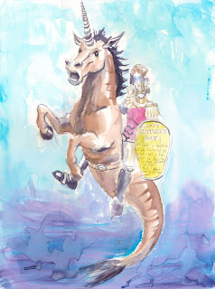
Also, just so I don't leave with no new art, here's two pieces. The first is a WIP tarting up of one of my recent sketchbook drawings, which may or may not ever get finished. The second is a piece of space art I did a while back for fun, just because space art's so fun and quick. 


www.oscarts.org
oscarbaechler@gmail.com

12/6/08

First half of sketchbook, best-of

The primary form of traditional art I do in terms of quantity is without a doubt sketchbook doodling. I try to draw every day on the bus to and from work, which means that when I'm "on" I can get two hours of drawing a day. I don't have a 100% success rate, especially if I end up taking a nap or can't get a seat, but in comparison I'll at best do one photoshop illustration on the weekend.

Really quick, here's some thoughts on my sketchbook process, which can differ hugely from artist to artist.

•I use 11" by 14" Cachet acid free sketchbooks, which are bound in black hardcover rather than spiral. I like them because they're highly protected since they've got spines and thick covers, which means they'll be protected years from now. I like the large format (but not a hugely ridiculous format) because it's the largest format to fit in a backpack or totebag, and I won't kill people on the bus by whipping it out.
•I start by dating the inner cover. This particular sketchbook is dated "November 3, 2008...One day to the election!!!"
•I write "FRONT" on the inside cover as well. I've had numerous sketchbooks that I accidentally start from both ends.
•I then write a list of subjects on the inside cover, as a way to avoid artist's block. I find that when I don't feel like drawing, I can just look at this arbitrary list of subjects and just pick something, then force myself to draw that. Here's the current list:
---life drawing (people on the bus)
---Head (as you'll see, I do this one way too much)
---Full body
---Gestures
---MONSTERS!
---Abstract
---New Media
---Write
---Arbitrary line of action (this is a technique I developed, in which I draw any sort of squiggly line, then start attaching a person to it. Very organic!)
---RPG races
---RPG character (By "RPG races/character" I'm referring to an old favorite for inspiration of mine. I'm frequently creating characters for D&D games and such, and also have several long-term RPGs I've been designing myself. So even if I don't feel like drawing a person on the street or random fantasy crap, it feels good to draw my characters, as a way to get in character.)

•Drawing on the bus is an artistic skill in itself. Many people I know gave up on the idea, due to how the bumping, shaking, starting, stopping and embarrassing onlooking crowds discourage good art. But like anything, it just takes a lot of practice. At this point I think my bus habits have been folded into my technique, which has led to a more careful and precise, value-based method in general (albeit at the lack of gestural quality.)
•I also draw primarily using mechanical pencils. Mechanical pencils on a bus? It's like I combined the most erratic and harsh things I could! But similar to drawing on the bus, drawing with mechanical pencil just takes time. I also have a specific recommendation if you're drawing with mechanical pencil, and need a way to avoid the harsh, sharp, paper-indenting quality it's usually associated with. To draw gently with mechanical pencil, I recommend using training wheels by overextending your lead, even to around an inch long. What will happen over time is that you HAVE to start drawing softly, or else your lead breaks. over time you'll develop a soft touch, and you'll also find that you can increase or decrease your line weight by increasing or decreasing the length of your lead. Once you master these things, you've got two luxuries: first, you'll never be choosing between short, stubby old pencils and long new pencils. Second, you won't have to sharpen any more. Give it a shot, eh?
•Lastly, I mark the final page of my sketchbook with the date it was finished. The theory is to get better at filling it up faster every time.

And now for the point of this post. With the last sketchbook I finished, the whole time filling it up I kept planning to post the best stuff on this blog, and make it a regular habit. Unfortunately, by the time I finished it, there was too must stuff to put up. Do you have any idea how boring and time-consuming it is to scan stuff? Blah! I'd rather be drawing.

So with my current sketchbook, I decided to post my stuff at the halfway point, as a way to cut the workload in half. So here you are, the first half of my November 3rd sketchbook. These drawings were my favorites of this half, although I had to nix a few excellent (but work-related) sketches. Here goes!
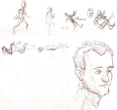
This was two things: some quick gestures for a death animation, and a decent head. One problem I've been running into is that I draw heads WAY too much. It's my favorite part of anatomy, and also the part of anatomy I'm most comfortable with. A lot of this translates into my favorite parts of 3D: facial rigging. I also recently created an in-house head generator to mass produce avatar options, and thus have been in a mood of recording different facial features.
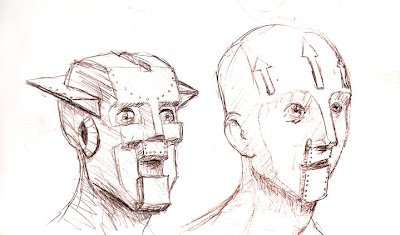


I drew these robot heads on a trip up to Bellingham, WA to help my brother move.
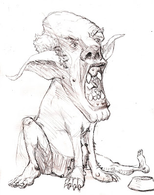


Also drawn on my way to Bellingham. The nipples were my brother's idea.
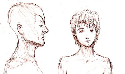


More heads, trying to get a handle on different facial features, such as "Pink Flamingos" eyebrows and a more protruding lip tubercle.
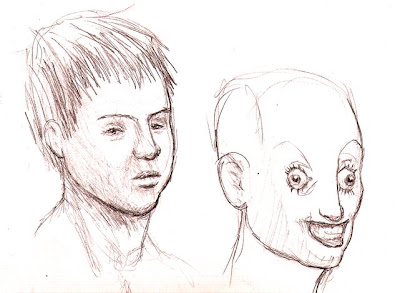


More heads, studying mongoloid features and skeletally stretched skin.
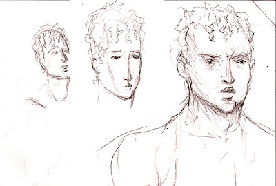


MORE heads, studying what I think of as Greek/English features: low noses, small pouty mouths, and smooth zygomatic processes.
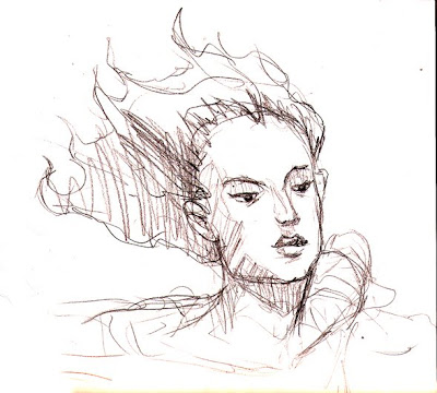


I was trying to recreate what I think of as "Waterhouse Chin," referring to the recurring muse of John William Waterhouse's paintings, most famously seen in his masterpiece "Lady of Shalott." It's partially due to the upward tilt of the head, and partially due to the square jaw offsetting otherwise feminine features.
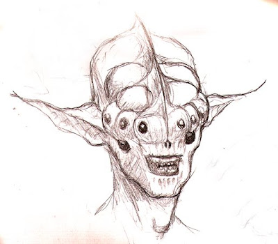


My favorite yet! I like that I retained some human qualities in this, and although I went waaay off the "realism" cliff, I think I maintained a realistic anatomical bone structure in this.
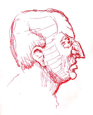

Another random head, with my most common "alternative media" of pen. Considering this was drawn from imagination, I felt happy with how realistic it turned out.
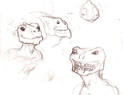


Toying around with the anatomy of an alien species...I'm going for two tongues (the main aberrational feature), broad, short heads, lizard/dinosaur features, and semi-permanent wide eyes and grins. Still needs some work, IMHO.
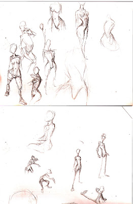


Some gestures and studies of torsos. I think I was feeling guilty about drawing nothing but heads.
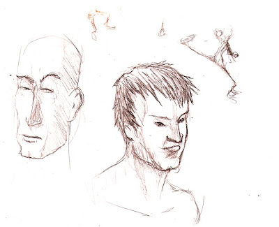


Aaaaand lastly, some more heads and a gesture drawing.

Here's hoping the second half of this sketchbook was as fun as the first.

www.oscarts.org
oscarbaechler@gmail.com

10/15/08

An art history hobby project: six degrees of mentor separation

I'm currently reading a book on Gil Elvgren, who is arguably the greatest pin-up artist of the golden age of pin-ups. The nature of the golden age of pin-ups is that the genre worked side by side with the golden age of illustration, and in the section on Gil Elvgren's influences and contemporaries, it does in fact feature works by several of my favorites; Andrew Loomis (IMHO the greatest teacher by publication in representational and figurative art history) is prominent, as is the buzzword artist of the illustration genre, Norman Rockwell. It's also worth noting in this chain that Loomis is listed as a primary influence of Alex Ross.

One thing I can most definitely say for Andrew Loomis is that, in his book "Creative Illustration," he credits his major influences. Principle among them is Howard Pyle, and he reprints a document of Pyle's which meticulously outlines the exact scientific nature of how light works. Howard Pyle's paintings might not have been the most beauteous of the age (certainly nothing to scoff at though) but he ended up with a much greater influence than his contemporaries because of his contribution to artistic education.

Now the question arises: who taught Pyle? A quick glance over Wikipedia will show that artists are frequently documented with their noteworthy students, but less frequently with their noteworthy teachers. And more important than Howard Pyle, who can trace an artistic lineage all the way back to someone like Da Vinci? The next important idea (especially in terms of Pyle and Loomis, who specifically published as a form of teaching) is whether an artist was directly mentored by another artist, or just intensively studied them. Especially in our modern world, resources needed to STUDY an artist are legion, but it's rare to directly apprentice under James Bama, Alex Ross, or similarly impressive name-drops. That is, unless you pay out the ass for animationmentor.com's resumé of Lucasarts and Pixar veterans. As Jimi Hendrix said, let me stand next to your fire.

That being said, I think that due to technological proliferation (whether it be the ease of internet or revolution of industrialized printing presses) at around 1910 or so, it became increasingly plausible for a young artist to "study under" a historic artist simply by examining his works and artifacts. Alex Ross is the greatest example of this, especially with him listing Andrew Loomis as an influence. Did he study under Andrew Loomis? Technically no, but he was part of a generation whose realistic artists undoubtedly owned all of Loomis' books. Loomis, lacking mass produced instructional texts, represents a generation that needed hands-on instruction. Theyir primary methos of learning were apprenticeship, their local gallery, and (Leonardo's favorite) learning through good ol' fashioned study of nature.

The modern generation is different in my opinion. For one thing, we have a vast population of talented artistic teachers who yell at us to go study nature; I think we're more likely to do so just because it's said much more frequently. Second, we can tailor who we WISH were our influences, learn about these tailored influences with the ease of a google image search. I recently saw my first ever Walter Langley painting through the randomness of the internet. I instantly fell in love, looked up a bunch of his stuff, and plan to regularly return to his paintings in hopes he rubs off on me. Even doing this through the library is easier, as the internet lets me manually check out Langley-related books in a moment. And thirdly, the modern artist is different because we exist with the luxury of "Tutorial Culture." Do you want to be a matte painter? Go explore www.3dm3.com and, with a few days of tutorial crunching, you'll be closer. Want to be a rigger? Go to www.rigging101.com and, with a few days of tutorial crunching, you'll be closer. Want to find out who's way better than you, then ask them questions about where to go next? Go to CGtalk and explore their "best of" section--expect a major blow to your self esteem and a major step forward in your understanding of representational/cartoon art.

But the question still remains...who can trace their artistic family tree back to Leonardo Da Vinci? Can you?


www.oscarts.org
oscarbaechler@gmail.com

10/3/08


You know what I love? Starting personal projects, then saying "ooh, look over there!" and starting a new project.

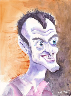
Such as this photoshop painting! I wanted to do a high-detail caricature in the vein of John K. Although it's colorized, it hasn't actually been colored. I think this has some potential, so long as I don't get excited about some new thing I started.

www.oscarts.org
oscarbaechler@gmail.com

9/14/08

I must admit, I dropped off for a while on blogging. I've been stretching my legs as art director at Prophetic Sky, and having a blast. I can't shed too many details, but here's some newer developments in my artistic arena I've rather enjoyed...

First off, Blender is awesome. The more I use it the more I like it, and I feel like I'm completely over that "new program" hump of learning. Anything beyond this point is advanced stuff, such as masterful rigging, nodal interface, and Python scripting. My goal is to learn python scripting, because aside from its uses with blender, it now transfers over to Maya and actual programming. That's one issue with MEL--if you're not in Maya, what's the point?

Second off, speaking of new programs, I've been learning MaPZone for procedural texturing. I've done a little of this in Maya's hypergraph, but MaPZone truly knows what it's doing. Furthermore, procedural texturing is truly an art unto itself--how do you make a texture when you're not allowed to simply add pixels by hand? Try it out, it's free! www.mapzoneeditor.com

Thirdly, I've been handling a new field for me--2D orthographic buildings. It's a new frontier for me, because I'm not only focused on character stuff usually, but it's also from the classic pixel RTS/RPG top down view.

And lastly, since I ought to post something worth seeing, here's a WIP for an idea I wanted to explore. It's essentially a huge, two-headed war tortoise, which will hopefully have that gargantuan feeling of an oliphant from LotR. Check it out!
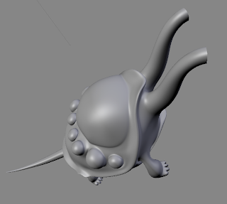


Next big chunks are the head and anatomically correct feet, and after that I'm going to be modeling all the little detail stuff.

www.oscarts.org
oscarbaechler@gmail.com

7/8/08

Happy Birthday dad!!!
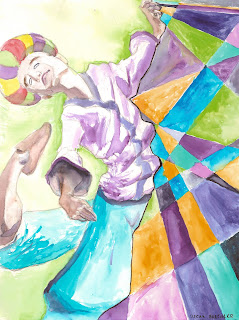

I painted this for my dad's birthday/father's Day present. And I'm psyched at how it's turned out! After grabbing a DVD of "Travels in Europe with Rick Steves" from the library, an image/concept that stuck in my head was the dervish dancer from the episode on Turkey. So I painted him, and am pretty happy with the result. Happy Birthday, dad!


www.oscarts.org
oscarbaechler@gmail.com

6/30/08

Thoughts on Blender

I'm much deeper into the rabbit hole of Blender now, and a particular analysis of the program has stuck in my mind. 

It goes like this: Blender's biggest shortfall is its age. The program is still only about ten years old, while Max, Maya, Lightwave, XSI, etc. are often twenty, twenty five years old. As a result, those programs have had a lot longer to add on new features, remove problems, or adjust what's already there. 

But there's the rub: all these "additions" are basically polishing something already in existence. The result? Due to the built in hierarchy of Maya or Max now, there's some problems they can't fix, because these flaws have become an integral part of pipelines everywhere. So to change a major part of Maya or Max, they have to rip out a ton of infrastructure.

Now try jumping into Blender, and you'll soon discover all sorts of things that they change from other programs, because they don't have to restart from the ground up. As a result, things like basic movements, the graph editor, character tools, weight painting and the like work the way they should. 

Weight painting is a great example. In Max and Maya, the first thing you do when learning to weight paint is pull out all your hair. The reason is because you have to get comfortable with the mathematics it's based around: adding up to %100, no more no less. So it ends up pissing you off when you can't increase a bone weight, and it especially pisses you off when you reduce weight to 90%, and it shoots to some wonky bone in order to automatically add up to 100%.

But mathematically, how does that make sense? Anything divided by itself equals 100%, so Blender goes off a splendidly additive system. If you've only got a cumulative 90% of the weight distributed (aka 90%/90%, aka 1) it doesn't jump to new places. If you've got (GASP!) two different bones at 80% (aka an unimaginable 160%) it just figures out the math any third grader should be able to handle, and puts 50% weight in both areas. 

It's clear that Blender's youth may limit its functionality so far, but at the same time Blender's youth means it tore down a lot of the broken, unfixable ideas from other programs. To date, I've used Blender tools for modeling, UV unwrapping, rigging, skin weighting and animating, and all of these have left me pleasantly impressed. 

www.oscarts.org
oscarbaechler@gmail.com

6/17/08

My movie to-do list

The problem with IMDB's top 250 movie list is that it's too democratic; any 13-year-old kid can create a profile and rank The Matrix higher than The Third Man.

The problem with AFI's top 100 films is that it's too mired with dogma. Some secret panel of men with long white beards tell us what's good, often when historical significance or precedence is all a film has going for it (Snow White's on it, not because it's the best animated feature, just 'cause it was the first.)

But combine the two, and you get an excellent cross-reference of the gems of our cinema landscape. So I'm going to get back on the wagon and make the big push to round out AFI's top 100, as well as the first 100 of IMDB's 250. Here's what I've got left:

IMDB
1. Paths of Glory
2. M
3. The Lives of Others
4. Double Indemnity
5. Eve
6. Spirited Away
7. Downfall
8. Metropolis
9. Modern Times
10. Rebecca
11. Life is Beautiful
12. Some Like it Hot
13. City Lights
14. The Seventh Seal
15. The Elephant Man
16. Touch of Evil
17. Once Upon a Time in America
18. Kramer vs. Kramer
19. The Great Dictator


AFI
1. Some like it hot
2. African Queen
3. The Grapes of Wrath
4. Bonnie and Clyde
5. High Noon
6. It happened one night
7. The Best Years of our Lives
8. Double Indemnity
9. West Side Story
10. Birth of a Nation
11. A Streetcar Named Desire
12. Butch Cassidy & Sundance Kid
13. Philadelphia Story
14. From Here to Eternity
15. Mash
16. Stagecoach
17. Network
18. An American in Paris
19. The French Connection
20. Wuthering Heights
21. The Gold Rush
22. City Lights
23. The Wild Bunch
24. Modern Times
25. Giant
26. Duck Soup
27. Mutiny on the Bounty
28. Frankenstein
29. The Jazz Singer
30. My Fair Lady
31. A Place in the Sun
32. The Apartment
33. The Searchers
34. Bringing up Baby
35. Yanky Doodle Dandy

I'm watching All About Eve right now, which is freakin' terrific. In some ways, the art of the evil woman has been lost. Sure, there's still female bad guys, and catty teen girls are frequent villains. However, that truly lifelike, catty, two-faced type of the finer sex's uglier side is a rarely well-portrayed character. For more great films with this, I recommend The Manchurian Candidate, Sunset Boulevard and Singin' in the Rain.

http://en.wikipedia.org/wiki/AFI%27s_100_Years..._100_Movies
http://www.imdb.com/chart/top


www.oscarts.org
oscarbaechler@gmail.com

6/9/08

I have a confession...

The first step is admitting you have a problem...so I'd just like to confess that I've developed an addiction to the firefox plugin on www.stumbleit.com.

For those of you not in the know, stumbleit.com has you fill in your user's interests, then provides you with a time-sucking firefox button, which will randomly pull up pages relating to your interests. Here's one I just came across, for all you mac users:

http://www.opensourcemac.org/

But the main website you need to check out is:

www.stumbleit.com

Seriously. It'll replace your current "web 1.0" internet addiction in a heartbeat.

www.oscarts.org
oscarbaechler@gmail.com

6/5/08

More new art!
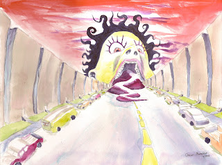


Here's some stuff I've been painting recently. One is a mother's day gift for my mom, one I gave to my brother at my bachelor party, and the last one's a present for a friend's birthday. Back in the day I would make attempts at art for people's christmas presents, but it's hard to pack in 20 to 30 pieces in one holiday season. So my New Year's Resolution this year was to paint for peoples' individual occasions, most notably birthdays. This system's been much more successful (although not bulletproof), and definitely facilitated much more frequent painting. 

I also have to strongly agree with the argument that you can never be good at photoshop until you've tried your hand at other media. The Art Institute of Seattle doesn't have painting as a requirement, but we do learn photoshop and illustration techniques therein. However, it was always a situation with me where I was terrified of the program. "Is this selection clean? Is this the right layer?" I would generally be far to careful and mathematical--like you can easily do in 3D. But once I started water colors, there's this intense difference. You're constantly making mistakes and resigning yourself to a lack of an eraser or undo key, so you drive on and create a finished product. Once I experienced that, photoshop and painter became much more free-form painterly and casual; in that last illustration I did, I was so lazy that I just had a "value" layer for most of the way through, laying down B&W, then just colorized it and had color-transferring layers on top of it. 

But enough of that, on to my new paintings! 

www.oscarts.org
oscarbaechler@gmail.com

6/4/08

New art
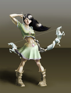

I've been rather busy these last few weeks...first off, I got married! The wedding was a blast, and I couldn't be happier. I don't deserve what I lucked into. 

Secondly, I've been doing some art projects in my free time, some as part of a skill test for a local company. But anyway, here's a chunk of concept art I did, which I'm rather happy with. Enjoy! 


www.oscarts.org
oscarbaechler@gmail.com

5/9/08

Blender 3D

Time to make the jump! As of right now I'm seeking ways to emulate as much of the Maya interface as possible. Also, it'd be interesting to mess around with the scripting language in Maya. My theory is that if it's anything like MEL scripting, I can get away with some copy/pasting and write a plug-in to switch to a Maya-esque UI super fast.

www.oscarts.org
oscarbaechler@gmail.com

4/25/08

11 Second Club WIP #2

Getting to the stage of tweaking and nitpicking, eh? I'm going away for the weekend, then hopefully I'll finish polishing this off before the month ends.


www.oscarts.org
oscarbaechler@gmail.com

4/24/08

Phantom Menace vs. Ratatouille: the importance of choice

I just watched a great film and a crappy film one after another: Episode 1 and Ratatouille. Episode 1 is traditionally blasted for Jar Jar Binks and a general stew of crappiness aside from that, and anything Pixar just gets a blanket statement about story, dreams, Renderman, etc. 

But I noticed a very specific difference between the two in terms of story mechanics this time, which I think is the key to why Rat was great and Episode 1 didn't measure up to previous SW films: choice as a story mechanic. 

There's a number of good films that put hard choices on the shoulders of characters. But in Ratatouille they go the extra mile: EVERYTHING is choice. Almost at NO point is Remy carried along by fate. He CHOOSES to break into the kitchen, to fix the soup, to go back and stick with Linguini, to let his family steal, soon and so forth. Choice is so big a part of the movie that even in the place when Remy is swept along by fate in the sewer early on, he's given an arbitrary choice of guessing which sewer pipe to go down. It's a meaningless choice, because he's guessing randomly, but it is nonetheless a choice, and therefore it carries emotional weight. As a result of all this choice, when it finally comes to the moment of truth, when Remy/Linguini have to rely on others and see if they're believed in, everyone else makes a choice, and it shows a lot of character for everyone involved: most leave, but the rat family finally believes in Remy, and Colette still believes in Linguini. 

Compare this to Phantom Menace, in which the characters are almost nailed to a conveyer belt. Engine trouble FORCES (ha!) the heroes onto Tatooine. Watto's supply monopoly FORCES the heroes to deal with him. With no worthwhile currency, they are FORCED to look at Anakin as a solution. Jar Jar is FORCED to follow Qui Gon due to a life debt. 

Sure, there's plenty of times where characters overcome odds in saber fights, podraces, etc, but they almost never made conscious, hard emotional decisions to be in those situations. The third act is the icing on the garbage cake: Metaphorically like all other parts of the movie, Anakin is forced into an auto-pilot starfighter that drags him into a situation where he saves the day. He has no heroic spirit or courage leading him to make choices others would fear. Similarly, Qui Gon's death is not a result of any internal, meaningful choice on anyone's part, especially Kenobi's or Qui Gon's. Instead, Obi Wan is forced into a spectator role, then afterward is just a dude fighting another dude. Imagine the guilt Obi Wan would feel if instead he made a bad decision, and that led to Qui Gon's death. Imagine the powerful message of love if Qui Gon sacrificed himself to save Obi Wan (as Obi Wan later does to save Luke, etc.). Less choreography, more choice please.

To analyze things further, compare Anakin (crappy hero) to Luke (good hero). Anakin does not succeed or fail by his choices, literally. In the new films we learn about a prophecy apparently meaning that Anakin's fate is already written in the stars. So who cares? WE knew he would be Darth Vader, and the reason he sucks is because apparently the Force new as well. 

But Luke? Luke is a hero of choice, of decision. It's never "he's a good guy, he's the hero, just trust me." He's presented with potent, troubling decisions about his father, his loyalty, his friends and his greed. And in all these cases, he CHOOSES the light side, rather than arbitrarily have his decisions made for him. Same thing with Han Solo. Imagine how meaningless it would be for him to pick off Darth Vader in the end, if instead he was with Luke to start with, just blindly on the good guy's side.


But enough of that! Back to work with me. I should have my trial-finished 11-Second-Club animation completed tonight. Stay tuned!

www.oscarts.org
oscarbaechler@gmail.com

4/18/08

On facial animation

I'm working on that 11-Second-Club animation right now, and I thought I'd say something (ha!) about lip-syncing. We only really had one or two classes at AIS involving lip-syncing, and I would argue that was good, because I do think it's takes a back seat role to physical body animation. 

With that in mind, a lot of what I know about lip-syncing I figured out by actually animating lip-syncs, and I've found a lot of the stuff I learned coincides with what you're supposed to be doing. Here's one thing I've found to be truly important about lip syncing (and, blah, I always remember it 100 frames into animating...). With fast-talking dialogue, you have to understand how it slurs, because the slurred form is how you'll end up setting keys.

Right now I'm animating the following line: "And you want to call it a health problem." To mark this phonetically every time a unique syllable comes up in writing is ludicrous. You'd be doing this: 

"Aah-nn-duh Yee-oo  Ww-ah-nn-tuh tuh-ook Caaah-ll..." so on and so forth. 

But when you slur it a bit, it comes out looking much more natural, because in fact we say 90% of things slurred. 

"An Oooh Ah NN Ahk  Ah it," so on and so forth. 

The jaw is especially important. It opens and closes far less than we think. If you do it every time a new letter shows up, you'll get speed-racer talk. 

So in conclusion, just like most animation, less keyframes is better, counterintuitive though that may be. Now hopefully by writing all this down, I'll remember it on frame 1 next time...

www.oscarts.org
oscarbaechler@gmail.com

4/8/08

I'm working on an animation for 11secondclub.com's April competition. Here's the first go at blocking stuff out. 

http://www.youtube.com/watch?v=2eXTU9seLSk

www.oscarts.org
oscarbaechler@gmail.com

4/3/08

Experimental animation's true calling

http://www.youtube.com/watch?v=JIzRI73gzrE&eurl=http://cgi.fark.com/cgi/fark/youtube.pl?IDLink=3513727

http://www.cyriak.co.uk/moo.html

And for the sake of vanity, here's my own experiment:  http://www.oscarts.org/production_03.html

As someone who has magical fantasies about someday dominating and mastering the indie/experimental animation market through a combination of bribes and demagoguery (only to be overthrown when I can't rig the vote...), it warms my heart that the modern landscape offers an opportunity for this medium which has been hitherto unknown. 

A while ago I found an anniversary archive of Cal Arts experimental animation from over 20 years or something. The article flippantly mentioned that despite this robust portfolio, the school began discouraging experimental animation because it's, shall we say, practically unmarketable.  

However, my generation has a much better opportunity to not only create experimental animation, but also profit from it. Here's what I think the major factors contributing to it are:

1. Internet distribution reaching a wide audience. How many people have seen Charlie the Unicorn? Ask this at a college, and you aught to hit at least 50%. Back in the day, you had to drop $50 on a festival submission fee so that 100 people could see your stuff. Now you can get it out there and build a rep without spending a dime via YouTube. Even better, a site like www.awntv.com or www.atomfilms.com lets you actually MAKE money off your cartoons through ad revenue. And even in the case of real-life viewings at film festivals and venues, you still have much better access; film festivals always have websites now, and it's far easier and less committing to hit "upload" than to send out a whole press package with a VHS tape. www.withoutabox.com offers a search engine that lets you submit a film to any film festival in the world, all from a central hub. 
2. Technology. Back in the day, animation was great because it could tell any story and show anything possible through the pencil. Well, in modern day  we essentially have a thousand new metaphorical "pencils" to explore looks, production techniques, stylistic approaches and motion methods. Flash, 3D, and After Effects mean that any video-oriented medium can be approached in a whole new way.

3. Exposure and learning resources. Distribution is terrific for the indie animator, but it's also great for the up-and-coming artist looking for a niche. Now when you're in school, there's a multitude of cartoons on YouTube that lets you hypothesize about your own ability to create such a cartoon. Similarly, you can easily find a number of great animations that are supplemented with tutorials, explanations, production focus, and a method of contacting the artist who created it. 

4. It's hip to be square! Disney famously set the pace for years in the animation industry, setting standards for quality, convention and popularity. And even when projects like Yellow Submarine or Fritz the Cat would try and make elbow room for the weirdos, they were playing to a very small weirdo crowd. But in today's landscape, kids love finding the primordial, aberrant animation that you can't necessarily throw on Cartoon Network. And even then, often times you can, and when the demand is high enough it DOES get on Cartoon Network. A great example of this is Jason Reitman, director of Academy Award-winning Juno, who back in the day was posting stuff on AtomFilms. Clearly, there's people out there who dig this stuff, and an ever-increasing crowd that'll drop 90 minutes on this market rather than on some Pixar-imitating SFX-laden piece that is nonetheless devoid of style and substance. 


www.oscarts.org
oscarbaechler@gmail.com

3/23/08

Neverwhere review

I read "Neverwhere" by Neil Gaiman before I had even heard of Sandman, and it encouraged me to check out a lot of his other stuff. It's a terrific book, and I've been wanting to see the BBC series for a long time, but wasn't willing to shell out for it. 

But hey! Now it's out at Hollywood Video, so I'm watching it right now. The production quality is a little, uh, BBC-esque, but the wiki says that the show came first, then Neil adapted it for a novel. This kind of explains the lower level of production, since it came before he was a truly famous writer. Nonetheless, the series is still wildly entertaining just based off of the strength of the concept: that we ignore homeless people and other street-culture vagrants because they actually exist on a slightly different plane of existence. 

In conclusion, if you're a big fan of Gaiman, watch the show and read the book; if not, you should still enjoy one of the two. You'll undoubtedly become a big enough fan that you seek out the other one anyway. Also, bonus: muzak/ambiance by Brian Eno. 

www.oscarts.org
oscarbaechler@gmail.com

3/21/08

The top five list of...uh...lists.

In a lot of ways, animation school is very much a frou-frou "build your own education" sort of experience, and although faculty may push you toward one direction or another, you can always just claim to be a 2D guy and only touch Maya for the required classes, or vice versa. 

However, all that aside, I think there's a handful of "commandments" that every animator should learn verbatim. People have memorized far greater quantities of info, and therefore I don't think there's a good excuse for spending three years at school and not learning these by heart. (Although I admit, if you put me on the spot I might fall short of reciting everything perfect...)

So, without further ado, here's my top 5 list of lists! 

1. Disney's twelve principles of animation. Ideally, one should know the complexities and intricacies of the twelve principles, and although animation varies greatly based off of experience, passion, talent,  and resources, generally one thing instantly sets bad animation apart from good animation. In bad animation, it's usually not that you're using a principle poorly; you're not using it at all! 

2. Blake Snyder's 4 elements of a logline (taken from his book "Save the Cat!") As Pixar says and everyone parrots, animation is all about story. Similarly, story is all about the logline. If you can't tell me a story in one sentence, it's a crappy story. In case you don't have his book (although you should definitely buy it), his four elements are...
1. Irony (Peter Sellers' "Being There" is an excellent example: a mentally handicapped dude rises to national politics.)
2. A Compelling mental picture. I think the two key elements of this step are first, a protagonist, and second, a complete story arc. 
3. Audience and cost. A lot of this lines up with Disney's "appeal" principle, and arguably cost determines how much of #1-#11 you can afford. 
4. A killer title. 

3. At least one of several story beat methods, which include Blake Snyder's Beat Sheet (also in "Save the Cat"), or for a less screenplay-focused model, any number of the "Monomyth" structures, better known as the Hero's Journey. Several of these formulas are described in the wikipedia monomyth page, and I frequently use a version provided by Stephen Glover, but it's generally the same: you have to hit certain story notes in a certain chronology, or else it's just a series of vignettes. 

4. Andrew Loomis' four steps for informal composition, as highlighted in "Creative Illustration." Okay, maybe this one's a bit of a stretch, but I think it's desperately important for one main reason: knowing this method means that Artist's Block is pretty much unheard of. Once again, I think this is a detailed abstraction of a Disney Principle (Staging), and it's important to start seeing everything as composition. I remember making thumbnails as a freshmen, and I couldn't see the forest for the trees. I would make my first mini design, then just draw fairly identical versions of it. But Andrew Loomis' method is a brilliant staple of drawing; you throw down some abstract lines, it makes abstract shapes, you fit your concept into the abstraction, and you get a dynamic and surprising new composition every time.

5. Andrew Loomis' four essential principles of tone, also in "Creative Illustration." Light is a science, not an art; it becomes art in how we interpret its inalienable properties, and Andrew Loomis provides the exact foundation for you to jump off of. Additionally, read his exerpt from Howard Pyle, who Loomis was building off of. I've heard variations of these principles from a number of artists, but as far as an empirical printed form, here's where to go.  Another analysis of these principles is to break down tone into their five categories: Halftone, Highlight, Core Shadow, Cast Shadow, Reflected Light. The best illustrators I've learned from (including Dave Ehlert and Bruce Sharp) generally teach to some version of this formula. 

So there you go. And I think it's worth noting that, even though I'm more technically oriented than traditionally oriented, none of these concern a computer program. Curious, eh? I think there's a number of other lists that didn't make the cut (for instance, uh, every chapter outline Loomis EVER had), but these are the essentials I try to keep within arm's reach of my computer chair. 

3/16/08

Auditory philosophy of the demo reel.

A lot of the feedback I've been hearing regarding audio on a demo reel is pretty blunt: if it's not a lip sync, just remove audio entirely. There's some good logic behind it. Worst case scenario, they hate your music tastes and therefore hate you, and the alternative worst case scenario is they like your music tastes and it's unfortunate that YOUR art isn't as good as that musician's art. Additionally, they might be listening to something already, and on the job-seeker's end of things, rendering without audio results in a smaller file size. 

But I think there's a rebuttal to this. Put simply, here's my philosophical model:

A. Your demo reel is a compilation of all your best art, and anything sub-par should be removed.
B. By definition of a demo reel, it shows off your editing abilities. 
C. Since the art of editing CANNOT be removed from your demo reel, it HAS to be polished into a beautiful "piece." 
D. As numerous media shows (previews, music videos, video in general, etc...), an integral part of good editing is based around your ability to present audio dynamically, so that it goes hand in hand with your visuals.
E. Therefore, a demo reel should have dynamic visual and sound editing.


But of course, then it's worth exploring what good editing is. After all, in the same way that no sound is still technically better than bad sound or over-complicated sound. What I've discovered is that the point when music on my demo reel sucks is when it's clashing with animations that are already animated to sound. I predict that in an ideal world, my demo reel will be comprised entirely of clips that already have a built-in sound narrative, and therefore no new audio is needed. 

And my render's done! So enough burning time. 

3/14/08

Screen capture software

I've been trying out some screen capture programs to get footage of my rigging goodies in action to throw 'em on my demo reel. So far I've tried two programs, with mixed results...

Copernicus: On the plus side, this program's free to use, and it's also available for mac. Unfortunately, the quality of the output is pretty bad, and you can't really mess with the settings too much. A lot of the captured frames seem to be blended between camera moves, and therefore get some weird artifacting. But, on the other hand, it pumped out a file successfully.

Camtasia: This was recommended to me by dudes at www.strutyourreel.com, and it's once again got some ups and downs. For one, there's no mac version, but that's pretty minor; I just rebooted in windows and installed it there instead. For another thing, it's only a 30 day trial. Bummer. And lastly, although it pumped out a native format video file (.camtec) it took me a couple tries to get the file format I wanted. However, the ends justify the means, and Camtasia's final output was great. The quicktime file I ended up with is great quality, and I look forward to replacing the ugly, way-too-fast copernicus footage.

First Post!

Hey y'all, my blog is now launched! I look forward to posting lots and lots of stuff. But to start things off, check out my website at www.oscarts.org, packed full of meaty animation goodness. Enjoy!