10/10/09

Ack! So behind on posting!

But not for lack of intrigue!

First, SeaBUG! It's first because, well, it's tomorrow. Me and some other Blender enthusiasts have put together a Blender User Group, where we'll be running tutorials and workshops on several aspects of Blender. Check it out! seabug.eventbrite.com

Second, Townrs Defender Lite is out! Try it out, see what you think and go buy the full version! TownrsLite

Third, Sketchbook news! Yes, I've completely, utterly fallen down on the job of my "sketch of the week." But in my defense, it's not for lack of sketching, it's for massive dislike of tedious scanning. I'm actually half way through my new sketchbook, despite never scanning the second half of my OLD sketchbook. Conclusion: Screw "sketch of the week," I'm just going to stick with my huge sketchbook dump every half-sketchbook.

Fourth, MORE Blender news! I'm going to be presenting at Blender Conference 2009 in Amsterdam! Supposedly the whole conference will be recorded, so I'll make sure to post a link once it's up.

Gah. Can't wait for the mind-numbing boredom of November. Ah, what a lovely fantasy..

www.oscarts.org
oscarbaechler@gmail.com

8/3/09

Release!

As art director at Prophetic Sky, it gives me great pride to share with you that our debut iPhone game is released!


Prophetic Sky Inc. Releases New iPhone Game: Townrs Defender

Seattle, WA Jul 30, 2009

Seattle, WA - Prophetic Sky Inc. is thrilled to announce the immediate release of Townrs Defender, a new game for the iPhone and iPod Touch. The application is available today on Apple's App store. This release brings a challenging strategic fantasy realm to the iPhone where players must defeat ruthless enemies and save their town. Choose between several magical weapons and master arcane spells, and use the terrain to your advantage. But watch out, the advancing armies outnumber you a thousand to one!

To play, navigate around the outside of your city wall and use guard towers, teleporters and the healing well to your advantage. Attack enemies with four different gestural attacks, and use the pinch motion to zoom in and out on the battlefield.

Play against three modes of difficulty on your iPhone or iPod Touch, and unlock a variety of hidden characters. Townrs Defender is the perfect fantasy roleplaying game for players of all ages, with hours of adventure packed into a single app.

A trailer is available on Youtube.
Pricing and Availability:
Townrs Defender is only $4.99 USD and available from the Apple App Store for the iPhone and iPod Touch. The game can be purchased here.

www.propheticsky.com
www.townrsdefender.com

Prophetic Sky Inc. was founded by Microsoft alumni Nick Elliott and Evan Moran in 2007, with a simple commitment to tell the world's stories through games. Prophetic Sky is located in Bellevue, WA. Townrs Defender is their debut product. For more information visit the Prophetic Sky website.

###

Oscar Baechler


www.oscarts.org
oscarbaechler@gmail.com

7/19/09

Sketch of the week #1

Already I'm enjoying the ramifications of doing a sketch of the week. After forgetting I'd planned on this and spending my week on gestural quick studies, I remembered it. Thus, I found myself encouraged to sit down and commit to something today, when normally I can often find myself only drawing on the bus.

I decided on a safe topic, my old favorite subject that, honestly, I draw far too much: heads at 3/4 rotation, lit from a side and above, caricatured and old.

I also discovered a great trick for blurring today. I scan these in at 600 DPI to get a lot of the fine line details. The problem is that then the little scratchy lines aren't blended into the full value regions I'd want. Normally I'd set a copied layer to multiply, and blur it to get the lines turned into shapes. But a quicker, dirtier way of doing it is just use the blurring power of aliased resizing; just transform the layer (Command + T) and shrink it down. Then transform again back to the full size, using snaps to get it pixel perfect.


www.oscarts.org
oscarbaechler@gmail.com

7/10/09

Sketchbook dump, birthday style!

First off, let me say that I'm going to switch to a "sketch of the week" formula for getting my art off of my daily sketching habits. Two main reasons for that; first, scanning half a sketchbook always eats a whole evening. Second, I think I'd enjoy the challenge of getting out a really solid drawing out every week, rather than doing too much flippant quick drawings.

That being said, on to the art.


The premise of this is a Heavy Metal-esque space harem, where some space dude's women just sit around bathing and smoking space hookah. Undoubtedly influenced by the egyptological art of the Napoleonic era, which had a number of fantastic harem paintings. (Do a GIS for Jean Leon Gerome if you need a new desktop background.)


A dinosaur.


Pachycephalosaurus drawn from a skull at the Colorado dinosaur museum.

Also, dinosaurs and birds have a freakin' bone cupping their eye! The sclerotic ring, look it up.


Compositional exercise. I find I'm doing more drawings like this, where I focus on perspective, figure and element placement more than full-on rendering of details.


Elf head study.


Monster thing.


Lady on the bus I drew. Good to get away from imagination drawing all the time

Should have some more news coming soon...

www.oscarts.org
oscarbaechler@gmail.com

5/28/09

Progress on monster project

I'm a firm believer in project-based learning. There's boundless reasons for it, but mostly I like how problems you should understand and assets you need will arise organically.

Case in point, my turtle monster project. I hated the chair on him, as did most people who saw it. Now he's got something much more likable: a sort of siege tower, which will have a rope ladder leading to a platform. On this platform, cultists will sit to charge up energy within the siege tower's "energy vortex" or whatever. Then, in a saddle slung between siege tower and extruding control posts, a driver will sit, controlling the turtle mount with dark energy from a staff.

As a result, I ended up needing a cinematic-quality humanoid rig! My plateau for this rig was simple: As many bones as necessary for smooth, accurate deformations, without yet going into the much more intense realm of scalar bone setups and muscle deformers.

Here's the initial result, sans a face rig and sans a few more correction bones (such as at the elbows and at the hands). But otherwise, this setup's pretty devoid of rubber banding and bending artifacts, which is all I really need. Next step, rigging the weight skeleton!

Also, here's an update shot of my turtle, with the beginnings of its newer siege tower.

Thanks to CyaNn, who made the shader I threw on these guys. Check out his stuff at the Blender Open Material Repository. His shader made these instantly look cooler than their boring ol' polygon versions as they currently stand.


oscarbaechler@gmail.com
www.oscarts.org

5/12/09

Top 10 Sketchbook drawings, February 24 to May 9

What a change! Last sketchbook's theme was gesture drawings, and although it went fast (January/February), I ended up with little worth scanning in. So this time around, the theme was finished drawings. I ended up with a lot more stuff rendered beyond mere gestures, and am a lot happier with the results. Here's my top ten favorites, possibly out of order.

#10. Southern slave-owning dwarf concept. Fun and challenging to draw!


#9. Head study. This is a lighting scheme I love to draw, which really clicked into habit from an Alex Ross lighting study for "Uncle Sam." Read it, it's amazing! I was watching Bill Mahr while drawing this, and I think Bill's certainly distinctive mug leaked into this.


#8. Muscular Russian head. Same lighting scheme habit as above.

#7. Two heads of opposite gender and emotional polarities. There's some braid studies to the left of the girl's head.

#6. Assorted roughs, plus a Hans Dahl-esque girl. I admit, I largely chose this in my top ten because I felt lacking in full-body drawings. As always, my love of drawing heads gets too much exercise. The text is me cataloging "monster-style" teeth I like to draw on monsters. Exhibited in rough is a favorite--inward pointing teeth.

#5. The hornbill at Woodland Park Zoo. I live near the zoo, I'm a member of the zoo, and I draw there as often as possible.


#4. Caricature of my dad. He's a bike rider of rare enthusiasm, and I tried to make this caricature of him as extreme as possible. I'm hoping to spruce this up in photoshop as a Father's Day gift for him.


#3. Bowing Satyr. I was quite happy with how this turned out. I was experimenting with something I like about certain Frazetta paintings, where he makes figures' cast shadows strongest on their own person, with shaded chests bleeding out and shadowing much of the lower body.

#2. Brick Fuggler, private dick. Why is this guy so fun to draw? I like that I can go back to older ideas for new inspiration.


#1. Head swarm. This was a lot of fun, and it made me realize how broad you can get when you try and draw in several styles all packed in together. Plus, I love drawing heads! The ugly old man at 6B and the Sean Penn-ish caricature at 3D are probably my favorites.


And although these are nice, I think the best drawing this time around is still the one I previewed in my previous post. So technically, this list goes to eleven.

My next sketchbook will be a new hurdle I am bound to struggle with. Why? Because the goal is to ONLY draw in color. Here's hoping it works out!

www.oscarts.org
oscarbaechler@gmail.com

4/24/09

Sketchbook Preview


I generally assign a theme to a new sketchbook. Often times it's a subject matter I want to focus on, sometimes a new medium, sometimes a new methodology. I usually base this choice off of whatever I struggled with or got bored with in my previous sketchbook.

My previous sketchbook had me focusing on full-body pictures and gesture drawings, as I wanted a better understanding of where I was placing anatomy before rendering it up. Additionally, I was relying too much on my classic crutch, head studies. I got a lot of success out of this gesture-oriented sketchbook, but with one problem: practically nothing rendered into fullness that I felt like posting!

As a result, I made fully rendered, finished pieces the focus of my current sketchbook. And now I've got way too much to scan! But it's almost finished.

Here's a preview, an attempt at Bouguereau-esque imagery of genteel girls doing girly things in garden settings. What a tool that Bourgeois Bouguereau is.


www.oscarts.org
oscarbaechler@gmail.com

3/4/09

The design choice for the future of web composition.

Safari 4 beta came out recently, and one of the big new features is a version of the Opera Speed Dial. It seems like blatant copy-catting to me, but I don't really mind; the more companies can steal from each other in tech wars, the better they become.

But it makes an interesting point about web design: Does your site succeed or fail when reduced to a thumbnail representation? This (the only accessable pic I could find, as Safari 4 prevents screenshots) shows how many sites, when reduced to thumbnails, all look the same. You can argue the Google map or the Wikipedia puzzle globe stands out as a graphic homepage, but otherwise these are all white sites with black scribbles. In fact, the most striking "speed dial" is the worthlessly non-loaded black picture.

http://www.sfgate.com/blogs/images/sfgate/techchron/2009/02/24/safari500x345.jpg
I think that although websites clearly deal with composition and layout as blocky news sources, they haven't really dealt with their future reality: appealing to users at a glance, with nothing but a thumbnail.

I think this also raises an interesting market ideal for web browser developers: How will you support site-defined thumbnails for sites? I'm sure that, if given the chance, the NY Times, Yahoo, et al, will want to set their own icon, in the same way they choose their mini icon for their URL.


www.oscarts.org
oscarbaechler@gmail.com

1/18/09

End of November through January Sketchbook

All done! It took a while to kill the rest of this sketchbook on account of all the moving I had to do this month. But, on the plus side, you can already see the benefit of my new apartment: proximity to the zoo! I look forward to many weekends to come spent drawing at the zoo.  I'll skip the commentary, other than I plan on getting away from doing heads all the time in my coming sketchbook.


www.oscarts.org
oscarbaechler@gmail.com

12/29/08

Thanks, white Christmas!

Seattle was covered in snow for a week and change until Saturday. Which was cool for me, because I got a week of working from home! Once again, props to Blender for being the open source wonder that it is; Had I been on Maya or Max, I'd need an at-home commercial license, and would have been out of luck like so many commuters in Seattle.

My other Christmas present is a new apartment in upper Fremont, which I'll be moving into in about three days. One of the best parts about this new location is that it's walking distance from the Woodland Park Zoo. As a card-carrying member of the zoo ($45 for unlimited visits, Definitely worth it!) I'm looking forward to regular visits with my sketchbook. 

As an additional item of business, the primary outline for what I hope is my first book has been completed. My New Years resolution is to have it completed this time next year. I am reminded of something Hubert Selby Jr., author of "Requiem for a Dream," said in his biographical documentary. If someone says they don't like it, or it can't get published, who cares? Send it to a hundred people, or a thousand. Something like that. Point being, it's better to write a crappy book and say you did it, and your next one might be better, than to be defeated by your own self esteem on day one. 

And, lastly, I returned to an old project, this time via the wonderful world of Blender! I originally made this project in Maya and Mudbox, but never really completed it. I've got a much better grasp of my modeling, unwrapping and texturing process now, and thus have finally started moving forward with some sort of color completion on this. 

There's many things I'd do differently on a second go-round for this. But since I think it silhouettes awesomely and was 75% completed already, no use in startng over. If you compare it with the original, you'll notice I made the upper body into a muscular, angry character this time around. Props to Blender's proportional editing falloff and sculpting tools! 


www.oscarts.org
oscarbaechler@gmail.com

12/21/08

The next generation of the gaming market.

I just typed this up for another quadrant of the internet, but it's something I've repeated so often that I thought I'd put it down somewhere official. Then in a few years I can look back and talk of how sagely or ignorant I was.

PCs are a difficult market because you can steal games. Consoles are a difficult market because you can resell games, thus limiting creators to one profit per hard copy when said hard copy changes hands five times. This often equates to a $50 sale and several $45 sales by GameStop, with creators only touching that initial $50. I think the future of gaming will be an evolution of the "Online Console Marketplace," where games are downloaded over proprietary hardware (consoles instead of PCs.) This gives extensive security against game stealing, and also eliminates the reselling dilemma. Furthermore, with proliferation of broadband (and if Obama does his rural broadband infrastructure thing, even more so) and hard drive space being a joke these days, the tech limitations that neutered this business model in the past are no longer concerns.
The only other part of this to address is the transference of interface. Many people (myself included) find a keyboard and mouse the ideal interface; a keyboard provides a multitude of keys and a typing interface to aid communication, while a mouse alone can provide as many buttons as an entire console controller. Furthermore, console joysticks can't provide the precision movements of a mouse. However, I think it's easy to get over this simply by providing more support for keyboards and mouses for console gaming, even packaging consoles with this option. One thing that Guitar Hero has shown us is that people don't mind maneuvering large piles of hardware to get a good gaming experience.

Anyway, that's my oft-repeated position on the future of gaming.

www.oscarts.org
oscarbaechler@gmail.com

12/13/08

Alien update


Here's an update on my alien I've been toying around with in photoshop. Since this was just for fun, I doubt I'll mess around with it any more. However, I'm glad I at least took the leap into color, which normally is where I get fatigued with my personal projects.


www.oscarts.org
oscarbaechler@gmail.com

12/10/08

The 100-pronged structure attack

Like every sniveling arts & culture nerd, I've been "working on my novel," which is so frequently ridiculed that it's hard to understand anyone posting about it, unless they already sold it to a publisher. But really quick, here's a few thoughts in my defense, many of which are just about my artistic philosophy in general.

1. I'm young! Better to start now at 23, rather than waiting until I retire or my kids go to college.
2. In my artistic experience (mostly with different forms of visual art, but also with cooking and writing) everyone starts off bad. You have X number of failed attempts and disasters in you before you'll produce anything remotely worthwhile. Hence, the best thing to do is just get these disasters out of the way as quickly as possible through regularly working on them. In a forgotten age, this was known as "Practice." In other words, the best way to look at your first novel is this: practice for your second novel. Thus, once I get this one out of the way, the second one will come faster and sharper.
3. I occasionally scribble this down as something I want on my tombstone: "The world's worst drawing is a lack thereof."  In other words, I'll take the guy doing the crappy, biginner's-step awful art over the guy who's too lazy to do anything but heckle any day. 
4. It's good for you, internally! I dislike it when people stretch creative muscles for the wrong reasons. Too many people figure their book would suck, and therefore not sell, and therefore serve no purpose. What ever happened to writing for fun?  In terms of what should motivate you for creativity, here's how I prioritize things: #1. Do it for yourself, #2. Do it for viewers/readers and their praise, and #3. Do it for material success. If I enjoy writing, who cares if it doesn't sell, or even if nobody likes it?
5. I feel like I've had enough of a win ratio with smaller writing projects that I can be motivated about this.


Now that I've written another overly long contextual introduction, here's what I wanted to bring up. I'm a big fan of structure. In fact, I think it's the most important part of writing. If it sucks and rambles in its outline, paragraph or logline format, it'll  suck in its larger format. Although my methods have changed, I haven't written a story without outlining in some form or another since sophomore year of high school. 

But what to outline with? There's any number of recorded outlining formats, and zealous cults form around all of them. Here's some of the ones I'm familiar with:

1. Syd Field's 3-act screenwriting formula
2. Any number of structural recommendations from Blake Snyder's "Save the Cat!" including his personal logline format and his 15 beat story outline.
3. The Hero's Journey, made superfamous from Star Wars
4. One my teacher Stephen Glover was a fan of was a 9-beat arc, labeled "You, Go, Seek, Find, Take, Return, Change." In other words, a protagonist plus six verbs.
5. Any number of "Adventure Planning Guides" recommended for roleplaying games.
6. An arbitrary order of events, which was the first way I outlined (before I knew outlining and structure were so beneficial.)

Furthermore, character outlining is something with many many models. It's another issue that's covered copiously in roleplaying games, with numerous models, and most authors I know have their own version. These outlines vary from lists of physical features (hair color, strength score, etc) to more probing, conflict-oriented inventories (what is your character ashamed of? What would make him sell out his friends?) 

I started extensively outlining D&D characters in high school using a document I made up called "Oscar's Exhaustive Character Outline." A year or so later, in theatre class we were given a character outline to fill out for homework, and I liked seeing the similarities and differences between my outline and my teacher's outline. The outline focus in my past payed off, as I was one of only two students to get an A on the assignment. (The other was my wife!) After the assignment, I added many of the questions to my own personal outline. Over the years, so many character outlines have been incorporated into my own, including stuff from practically every RPG or creative writing-oriented teacher I've come across. 

Currently, I occasionally get stuck on a part of my story outline. So what I've been doing is going back to the parasitic, absorbing nature of my Character Outline. If I can't figure out the breaks and beats using one form of story outlining, why not try out another? Most of them fit into each other, but by having these other options available, I can pick and choose what works best at the time. 

Case in point, I landed on the smallest form of story--a title, a main character, and a logline. I then jumped into my personal story arc outliner (a mix between Glover's setup, Snyder's setup, Hero's Journey setup and arbitrary order of events.) But I couldn't get it! I didn't know what to do in the second half. The breakthrough came when I first tried doing each method separately as far as I could take it, and finally tried labeling each of the "Three Acts" with a sentence each. 

Suddenly it came easy. At that point, I discovered I had no trouble labeling acts One and Two. After that, the task of thinking up a single sentence for the last third of a book seemed easy. 

I guess what I'm advocating is that you avoid writer's block by seeking out wiggle room. If you hit a wall outlining, it doesn't mean your story sucks, and it also doesn't mean the god whose altar of outlining you worship at is full of crap. It just means that you'll benefit from a little perspective, eh? 

www.oscarts.org
oscarbaechler@gmail.com

12/8/08

State of the Union

A couple thoughts on a variety of topics. First off, I watched "The Hulk" tonight. The Hulk is already a throwaway character in my opinion, and I think they did well with what they had. He's a big strong dumb one-dimensional hero, with a devastating lack of memorable villains, but they stuck to what made him endearing, story-wise. As Marvel has wisely figured out, you don't go to these films to see Iron Man or The Hulk; you go to see them for Tony Stark and Bruce Banner, the people behind the mask. So considering General Ross is more of an archetypal "military badguy" than a memorable character in himself, and Abomination is pretty much Ugly Hulk, they could do worse. There's something I like to bring up in comic book movie debates, regarding how you should grade on a curve. Batman is arguably the strongest comic book property in the world, with three other contenders: Superman, Spiderman and Wolverine. Also, I'd say he and Spiderman tie for the strongest tier of memorable villians to draw from. When you consider this, then consider that 90% of all Batman movies are unwatchably bad, it's hard to criticize The Hulk too much. 

Also thought I'd throw in two museum reviews. First, I finally saw the new Seattle Art Museum, and it's fantastic! Visually stunning when you walk in, a sense of storyboarding as you round corners and enter new rooms, and a much better flow of exhibits from one wall to another. They also bring out more of their large pieces thanks to their huge open spaces. I used to be a harsh critic of the SAM, and even though I could respect their focus on a comprehensive inventory of art history, I thought it was poorly executed. Unless the feature exhibit was interesting, it wasn't worth the money. Sadly, I was late to the exhibit I had been hoping to see (the forerunners of the impressionists), but the revamped museum was nonetheless a treat.

Additionally, I just saw the Frye's Egypt exhibit again. I think this was a great collection of work, and it held a special place in my heart for having a piece by Lawrence Alma-Tadema. However, they're tie-in video exhibit, "Empire," felt like garbage to me. Never trust art that doesn't hold any meaning until you read the Artist's Statement. The point of this was to tie into Egypt, Aztecs and Napoleon the modern equivalents of parts of those empires, which is through lavish latin parties and soccer hooliganism. Or at least, I'm sure the people behind this used some excuse like that to obtain grant money. They then procrastinated until a week from their deadline, then panicked and rushed stuff together. The result is some interviews with soccer fans and filming a roof party in Brazil. Maybe I'm reading too much into the motives of "Empire"'s creators. Then again, it takes a loooot more reading too much into their work before it gets the benefit of the doubt. 

Also, just so I don't leave with no new art, here's two pieces. The first is a WIP tarting up of one of my recent sketchbook drawings, which may or may not ever get finished. The second is a piece of space art I did a while back for fun, just because space art's so fun and quick. 


www.oscarts.org
oscarbaechler@gmail.com

12/6/08

First half of sketchbook, best-of

The primary form of traditional art I do in terms of quantity is without a doubt sketchbook doodling. I try to draw every day on the bus to and from work, which means that when I'm "on" I can get two hours of drawing a day. I don't have a 100% success rate, especially if I end up taking a nap or can't get a seat, but in comparison I'll at best do one photoshop illustration on the weekend.

Really quick, here's some thoughts on my sketchbook process, which can differ hugely from artist to artist.

•I use 11" by 14" Cachet acid free sketchbooks, which are bound in black hardcover rather than spiral. I like them because they're highly protected since they've got spines and thick covers, which means they'll be protected years from now. I like the large format (but not a hugely ridiculous format) because it's the largest format to fit in a backpack or totebag, and I won't kill people on the bus by whipping it out.
•I start by dating the inner cover. This particular sketchbook is dated "November 3, 2008...One day to the election!!!"
•I write "FRONT" on the inside cover as well. I've had numerous sketchbooks that I accidentally start from both ends.
•I then write a list of subjects on the inside cover, as a way to avoid artist's block. I find that when I don't feel like drawing, I can just look at this arbitrary list of subjects and just pick something, then force myself to draw that. Here's the current list:
---life drawing (people on the bus)
---Head (as you'll see, I do this one way too much)
---Full body
---Gestures
---MONSTERS!
---Abstract
---New Media
---Write
---Arbitrary line of action (this is a technique I developed, in which I draw any sort of squiggly line, then start attaching a person to it. Very organic!)
---RPG races
---RPG character (By "RPG races/character" I'm referring to an old favorite for inspiration of mine. I'm frequently creating characters for D&D games and such, and also have several long-term RPGs I've been designing myself. So even if I don't feel like drawing a person on the street or random fantasy crap, it feels good to draw my characters, as a way to get in character.)

•Drawing on the bus is an artistic skill in itself. Many people I know gave up on the idea, due to how the bumping, shaking, starting, stopping and embarrassing onlooking crowds discourage good art. But like anything, it just takes a lot of practice. At this point I think my bus habits have been folded into my technique, which has led to a more careful and precise, value-based method in general (albeit at the lack of gestural quality.)
•I also draw primarily using mechanical pencils. Mechanical pencils on a bus? It's like I combined the most erratic and harsh things I could! But similar to drawing on the bus, drawing with mechanical pencil just takes time. I also have a specific recommendation if you're drawing with mechanical pencil, and need a way to avoid the harsh, sharp, paper-indenting quality it's usually associated with. To draw gently with mechanical pencil, I recommend using training wheels by overextending your lead, even to around an inch long. What will happen over time is that you HAVE to start drawing softly, or else your lead breaks. over time you'll develop a soft touch, and you'll also find that you can increase or decrease your line weight by increasing or decreasing the length of your lead. Once you master these things, you've got two luxuries: first, you'll never be choosing between short, stubby old pencils and long new pencils. Second, you won't have to sharpen any more. Give it a shot, eh?
•Lastly, I mark the final page of my sketchbook with the date it was finished. The theory is to get better at filling it up faster every time.

And now for the point of this post. With the last sketchbook I finished, the whole time filling it up I kept planning to post the best stuff on this blog, and make it a regular habit. Unfortunately, by the time I finished it, there was too must stuff to put up. Do you have any idea how boring and time-consuming it is to scan stuff? Blah! I'd rather be drawing.

So with my current sketchbook, I decided to post my stuff at the halfway point, as a way to cut the workload in half. So here you are, the first half of my November 3rd sketchbook. These drawings were my favorites of this half, although I had to nix a few excellent (but work-related) sketches. Here goes!
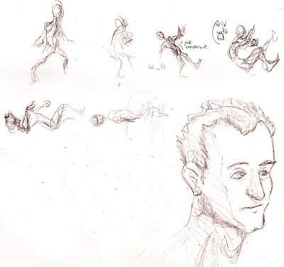
This was two things: some quick gestures for a death animation, and a decent head. One problem I've been running into is that I draw heads WAY too much. It's my favorite part of anatomy, and also the part of anatomy I'm most comfortable with. A lot of this translates into my favorite parts of 3D: facial rigging. I also recently created an in-house head generator to mass produce avatar options, and thus have been in a mood of recording different facial features.
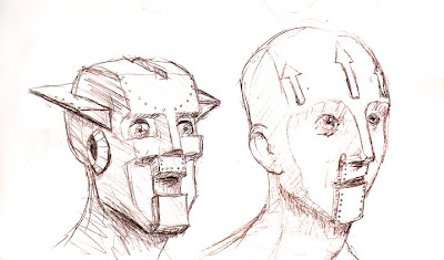


I drew these robot heads on a trip up to Bellingham, WA to help my brother move.


Also drawn on my way to Bellingham. The nipples were my brother's idea.


More heads, trying to get a handle on different facial features, such as "Pink Flamingos" eyebrows and a more protruding lip tubercle.
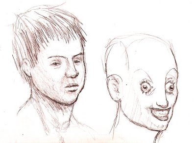


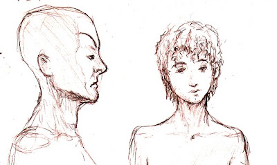
More heads, studying mongoloid features and skeletally stretched skin.
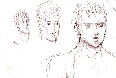


MORE heads, studying what I think of as Greek/English features: low noses, small pouty mouths, and smooth zygomatic processes.
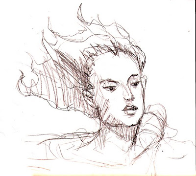


I was trying to recreate what I think of as "Waterhouse Chin," referring to the recurring muse of John William Waterhouse's paintings, most famously seen in his masterpiece "Lady of Shalott." It's partially due to the upward tilt of the head, and partially due to the square jaw offsetting otherwise feminine features.
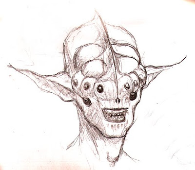


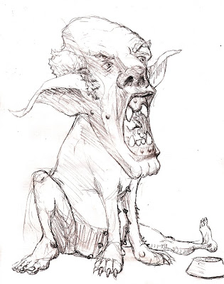
My favorite yet! I like that I retained some human qualities in this, and although I went waaay off the "realism" cliff, I think I maintained a realistic anatomical bone structure in this.
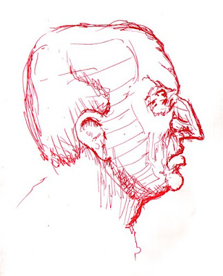

Another random head, with my most common "alternative media" of pen. Considering this was drawn from imagination, I felt happy with how realistic it turned out.
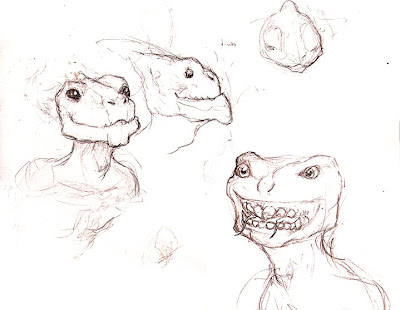


Toying around with the anatomy of an alien species...I'm going for two tongues (the main aberrational feature), broad, short heads, lizard/dinosaur features, and semi-permanent wide eyes and grins. Still needs some work, IMHO.



Some gestures and studies of torsos. I think I was feeling guilty about drawing nothing but heads.
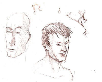


Aaaaand lastly, some more heads and a gesture drawing.

Here's hoping the second half of this sketchbook was as fun as the first.

www.oscarts.org
oscarbaechler@gmail.com